Amplification Through Simplicity

Some time ago I wrote a post on building empathy and the importance of the audience in building understanding. I was drawing on a study conducted by Fritz Heider and Marianne Simmel in 1944, coupled with a theory from Scott McCloud which linked the amplification of meaning with the simplification of form. I posed, in that post, a general question: how far could I push a mini-comic towards simplification, and how would this impact its interpretation?
So I decided to test it.
I devised a basic test with three rough stages. In each stage, a mini-comic would be produced and the audience asked to comment on various aspects of it, explaining what they understood the story to be, the motivations of the characters, and any areas that were difficult to understand. For parity, the structure and plot of the mini-comic would remain consistent across each stage. It would be the visual presentation that changed from test to test. In simple terms, the comics would be:
Traditional western, without speech, captions, or audio text, except the title
Traditional western, but all text elements using a custom non-English typeface, except the title
Abstract. The visuals reduced to a far more simplistic form, without any form of text, except the title
For clarity, the use of the term “western” refers to the structure of the comic, the expected audience and how that impacts the reading structure. While images as storytelling devices are often considered ubiquitous and largely transparent in meaning, in that they do not require decoding, the sequencing of images, the layout and the intended direction across a page are very culturally specific. Western comics generally rely on temporal sequencing. Each image represents a new moment in time, later than the previous one. The image flow is usually Z-shaped, starting at the top left, then travelling right and down the page. However, this flow can be modified by ensuring that clear visual and textual cues inform the audience of the direction of travel from panel to panel (Cohn, 2020).
I am hoping that, through these three variations on the depiction of the story, I might find some truth or limits to the theory of amplification through simplification. How much can an audience be asked to bring to a story before the plot suffers? Is there a limit to what we can expect the audience to do to determine reason?
Since my last post, I have moved forward with creating a mini-comic to use in these tests. The first stage was the development of a plot. I wanted something simple, easy to understand and using a structure common to television and other story-based mediums. I also decided a cliffhanger ending would help. A cliffhanger in this context leaves the story open to continuation later, but more crucially, in the limited format of a mini-comic, it freed me from having to detail a potentially complex ending. This gave me more room to focus on the immediate action. The original plot outline is detailed below:
Small house surrounded by forest. The 1st character is in the house looking out when the 2nd character arrives. They are excited to see each other and greet each other.
The 2nd character reaches into their bag and reveals the MacGuffin. The 1st character seems entranced by it.
Monsters from the forest appear and might attack, or try to grab the MacGuffin.
The 1st character is still entranced by the MacGuffin and tries to touch it or press a button.
End comic.
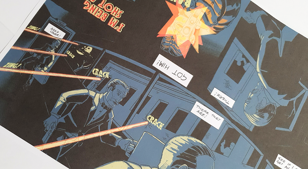
This rough treatment led to some basic panel layouts and a script detailing what each panel should show. This was a much more controlled method than I had approached for many of my other mini-comics, which ultimately resulted in it taking a lot longer than I had anticipated. To keep the sequence readable, I leaned on traditional shot descriptions and detailed what each panel needed to show. At this stage I was unsure how many panels I could reasonably pack into the tight confines of a mini-comic, so the final number changed somewhat once testing began. The panel layouts and script developed together, with discoveries on one informing the other. The near-final script, some panel tests and sketches are below.

The panel sketches and testing were useful in determining how many panels I could fit per “page”. This informed the sketch, and vice versa. This early development was all done on paper, but led to the final layout developed in the digital version.

Early on, I had decided that the characters would be connected in some way, but whether they were family, friends or a couple of some sort, I thought the readers could determine. I also decided to make one feminine and the other masculine. This was more to suit my drawing ability, as I was unsure if I would be able to create subtle enough distinctions between them otherwise. I ultimately also used slightly different colour palettes to help distinguish them.

Construction:
With the initial testing resolving the primary decisions, I was able to begin building the comic in earnest. Most of the thinking had been resolved in preproduction, so it became a largely mechanical process of getting the images made. There were still decisions regarding the colour palette to help distinguish the key characters and elements, as well as using blue line work rather than black. I was concerned that heavy inking would impact readability given how much I was trying to fit on a page, but the process was fairly straightforward. What was a surprise were the technical limitations I encountered.
Authorship and the “control” of software:
As an aside to the creation of the piece for testing, I ran into some real limitations when working on it. I originally opted to follow the process I usually use when working on a digital piece: sketches, refinement, clean line, colour, then each panel grouped and masked. However, as the visual detail was a lot higher than in my previous mini-comics, I found that Procreate limited my workflow. Specifically, the number of groups, layers and masks was considerably restricted.
This may have been an issue owing to my iPad, which is an older model, and working at A4 at 300 DPI may have pushed it beyond what it was intended to do. However, after some secondary research, I found that this issue was a common complaint among people who worked in Procreate as well as across other mobile platforms. As I had invested significant time in the software at this point, and changing platforms may have damaged the developed aesthetic, I persevered. But I had to change my workflow significantly and make creative decisions to suit the software and its limitations.
After a while, it began to feel like the software was almost a secondary creator rather than just the tool. I was changing how I worked and what I was willing to accept as an outcome to meet the imposed limitations. While all software has limitations and ways that it works best, other painting software, Photoshop for instance, has such a broad array of tools that almost anyone can find a way to make what they want. Photoshop, as software, acts as a tool. A complex tool, yes, but a tool as much as a pencil or paintbrush, in that the user is generally in charge.
With this project, and the limitations I encountered, I felt more keenly than ever before that the “how” of my work had been significantly altered to suit the tool. And so, in this respect, the question arose: how much of my work in this project is my work? And how much was done to suit Procreate? This led to the broader question of digital authorship and the control exerted over creators by the software they choose.
Testing:
With the comic finally done, I set about devising a basic test to determine how well the story was understood by the audience as the text was simplified or removed. The testing took some time, as I wanted to gather at least 25 samples before drawing any conclusions. I determined 25 was a reasonable number given the range of people available to me, and would ensure that common themes started to emerge and outliers could be identified.
The questions were assembled into a Google Form and presented to volunteers with a physical copy of the comic. The questions were broken into two halves. The first half gathered basic demographic and behavioural information, specifically aiming to understand comic fluency and whether there was any correlation with age. I did not concern myself with questions surrounding gender identity or biologically assigned sex, as recent comic readership surveys pointed to a very diverse range of readers linked by age more than any other cultural or biological identity (Baxter, 2026). While these aspects of a person may inform which comics they would read voluntarily, this was not a concern for this testing.
For the demographic and behavioural questions, I aimed for general groups and definitive answers encompassing the responses “yes”, “no”, and a midway option such as “yes, but not well” or “occasionally”. This kept the answers quick and highlighted general behavioural and comic literacy trends. The questions in the first half were:
What age range do you belong to? (Under 18, 18-25, then 10-year brackets going forward)
Have you read comics in the past? (Yes, No, and Yes, but not for some time)
Are you familiar with standard comic visual narrative devices, for instance panels, speech bubbles, captions and onomatopoeia for visual audio effects? (Yes, No, Not really)
Do you regularly read comics? (Yes, often, once a week; Sometimes, once a month; Occasionally, a few times a year; No)
The second set of questions related to narrative understanding and, along with the definitive “Yes”, “No” and “Maybe” format, many of the questions had open-ended responses. Being aware that the breadth of questions might make analysis difficult, I intend to use basic AI summarisation tools from Google to identify core trends. The questions in this half were:
Can you describe what happened in the comic in your own words?
Could you identify the character's emotional state in key scenes? (Yes, No, Sometimes)
Who do you think the main character is, and what are they trying to do?
What emotions did you think the main character was feeling throughout the story?
What motivated the character’s actions, in your opinion?
Was there any part of the story where you felt confused about what was happening or when it was happening?
Did the transitions between scenes feel smooth and understandable? (Yes, No, Sometimes)
What would help your understanding of the story?
Questions 8 and 9 in this section are predicated on question 7, and so the responses will vary a lot depending on who the reader feels is the main character. More than most of the questions, these three could be quite interesting, as I made a point of ensuring that both characters had an equal presence in the comic. So the “main character” is an aspect of choice less than comprehension.
I realised that, among the characters, there is potential for readers to identify with whoever most aligns with their own sense of self. While that is an interesting aside, it is beyond the scope of this study.
I have not fully detailed the results of this first stage here. I have only examined the areas that I feel are the most telling in response to the initial question I set out to explore.
Results:
Overall, the results were positive. Firstly, from a behavioural and cultural perspective, everyone surveyed had some familiarity with comics.
For question 2, “Have you read comics in the past?”, just over 3% of respondents claimed never to have read comics. Despite that, in Question 3, everyone had some level of familiarity with comic visual structure and devices. This indicates that, within the cultural pool I was drawing from, there was enough saturation of comics in other forms to allow a generalised understanding of the Western style. As I was operating from a metropolitan location with a European societal structure, I could safely rely on a left-to-right, top-to-bottom reading order. It was only when looking at remote communities such as those in Nepal, Papua New Guinea and far north-west Australia that the interpretation of image sequences changed, resulting in unintended meaning (Cohn, 2020).
With this basis established, it was time to examine the narrative understanding of the comic. The results of Question 5, which asked the reader to describe the comic in their own words, showed that broadly every respondent was able to identify the key elements within the narrative. This was fairly encouraging and supported the general position that, at this fairly developed stage, the narrative was easy to understand.
There was some variation, of course, with one respondent identifying the main characters as brothers. Curiously, none of the respondents identified the characters as both being female. This could be an indictment of my drawing abilities. That aside, every reader was able to identify the return of one character, the reveal of the item and the attack of the monsters. The ending, with one character aiming to press the button, was mentioned in some responses but not all.
Question 6 followed this with a simple “Could you identify the character's emotional state in key scenes?” Of the four possible responses, every answer was either “yes, sometimes” or “yes, always”, with the latter dominating at 58%.
Question 7 asked who the reader thought was the main character and what they were trying to achieve. This question brought more division. Of 29 responses, 13 identified the second character as the main character, with ten of these explicitly stating that the character was male. By contrast, only 9 identified the first character as the main character, and only five of those stated that the character was female or used female pronouns.
The primary reason given for the second character being the main character seems to be that this character brought the MacGuffin and is the originator of the events that follow. While I aimed for a diverse audience, I cannot rule out personal gender identity as a reason for the split in the choices.
The responses to Question 8 were dependent on Question 7. The emotional description provided depended entirely on who the reader saw as the main character in Question 7. As such, there is a similar division between the responses. This was carried through to Question 9, which asked the reader to infer potential motivations for the main character’s actions.
That said, there are certain themes that occur in the responses to Questions 8 and 9. Most respondents identified care, love, protection and/or curiosity as driving forces. The frequency of these responses suggests that the early panel showing the characters hugging has informed the respondents’ opinions, as have the three panels on the final page.
Overall, the results were positive. While the second half of the survey shows some splintering as the questions become increasingly dependent on audience interpretation, I am hoping that the second and third tests will help to solidify these findings.
The full results can be viewed by following this link.
Conclusion:
Honestly, I am not sure how I feel about this.
On the one hand, it would seem that the theory has legs. The audience can be relied upon to add meaning and narrative in a space where it is not immediate, or perhaps in a space where it is not spelt out. But was this really a surprise? Given the general clarity of the images and the relative safety with which they were constructed, did I expect any different?
I think the issue is the starting point. This is not the most interesting arm of the project. If anything, this is the most generic edge of the testing process. I find myself looking forward to the next stages, to generating some more challenging forms and getting some real comparative data so I can begin to find the limits of this theory within the context I have defined.
More broadly, there may be no limit. Humans will look for meaning in anything. The whole fortune-telling profession stands as testimony to that. So I guess the limit I am looking for is how far the form can be simplified or pushed and still have the audience generate a shared comprehension.
As a wrap-up to this marathon blog post, though, the idea of meaning amplification through visual simplification works. The bounds of it are still to be determined.




Comments